
Thursday, December 24, 2015
Friday, December 11, 2015
Comparing a counterfeit Parker Sonnet to a real one
As the trend of fountain pen usage comes back in fashion, the rise in the number of counterfeit fountain pens occurs as well. For first time buyers, this can be a costly and embarrassing mistake, one which could be avoided by sharing information with fellow enthusiasts.
I have the unfortunate honor, of presenting first hand information on the subject with everyone. While searching for a good deal on fountain pens in Ebay, I came across a Parker Sonnet at a too-good-to-be-true price. Despite noticing that the seller is from China, I threw caution, and common sense, into the wind, bid for the pen, and won.
Went the pen arrived, it felt wrong right from the start. The weight of the pen was lighter than the rest of my Sonnets, and the material felt a little cheap. A closer look revealed workmanship errors which was uncharacteristic of the Parker Sonnets.
Here are some comparison photos to help fellow enthusiasts in identifying counterfeit Sonnets.
"Jewel" on top of the cap


Loose nib on feed

For the Sonnet, the nib of the pen is fastened onto the feed mechanically, and should be a secure, non-moving fit. This example of a counterfeit has a feed that moves away from the feed on slight pressure.
I have already raised a dispute on paypal for this counterfeit, and even if I don't get my money back, the price I paid for it is low enough to be an inexpensive "lesson fee". Good hunting!
I have the unfortunate honor, of presenting first hand information on the subject with everyone. While searching for a good deal on fountain pens in Ebay, I came across a Parker Sonnet at a too-good-to-be-true price. Despite noticing that the seller is from China, I threw caution, and common sense, into the wind, bid for the pen, and won.
Went the pen arrived, it felt wrong right from the start. The weight of the pen was lighter than the rest of my Sonnets, and the material felt a little cheap. A closer look revealed workmanship errors which was uncharacteristic of the Parker Sonnets.
Here are some comparison photos to help fellow enthusiasts in identifying counterfeit Sonnets.
"Jewel" on top of the cap

While the quality of lower end Parkers have been questionable these past few years, they have still maintained some standards in their mid and higher-end products. The plastic "Jewel" on the top of the Sonnet cap should appear center, as shown on the left, and not touching the edge like the counterfeit on the right.
The depth of the lines on the arrow clip

One of the things that eluded Parker counterfeiters, has been the "feather" lines on the Parker arrow clips. Most of the time, the lines will be too shallow or not clear enough on a counterfeit (as shown on the right), though this could be hard to detect without a comparison.
Length of the threads

Small details, like thread count, isn't something most counterfeiters pay too much attention about. As shown on the right, this example of a counterfeit has a shorter thread than standard Sonnets, I have seen examples with longer thread counts in other Parker products.

The thread count of feed to section is about 1 and a half turns on a standard Sonnet, but this counterfeit requires 3 full turns.
Magnet-attracted nibs

This is the first test which I use for any Parker pens which I have doubts on. Modern Parker nibs are made of a non-steel alloy and should not be attracted by a magnet. As you can see on the right, the "18k" nib is obviously not what it claims to be.
Do note that counterfeiters have caught on recently, and I have a counterfeit of a Parker IM which can pass this test (failed the previous test though).

For the Sonnet, the nib of the pen is fastened onto the feed mechanically, and should be a secure, non-moving fit. This example of a counterfeit has a feed that moves away from the feed on slight pressure.
I have already raised a dispute on paypal for this counterfeit, and even if I don't get my money back, the price I paid for it is low enough to be an inexpensive "lesson fee". Good hunting!
Thursday, December 3, 2015
Hero against the World - Hero 336 vs Pilot U
If you have no idea what this series is about, please click here for a brief intro.
The challenger: Pre-owned Pilot U


The pen came with 14k 585 nib, and the older version of the Con-20. It writes like a F nib and has a unique feed which seem to be joined to the section.
Score Table

The challenger: Pre-owned Pilot U


There is little information about this pen online, all that I was able to gather was:
- Yes, this pen was manufactured by pilot for a short while.
- It might had been a predecessor to the Custom 74
The pen came with 14k 585 nib, and the older version of the Con-20. It writes like a F nib and has a unique feed which seem to be joined to the section.
Score Table
| Hero 336 | Pilot U | |
| Smoothness | ✔ | |
| Price | ✔ | |
| Ease of maintenance | ✔ | |
| Look & Feel | ✔ | |
| Filling mechanism | ✔ | |
| Ink flow | ✔ | |
| Hard Start | ✔ | |
| Feedback | ✔ | |
| Availability | ✔ |
Smoothness
I'm not sure if it is due to abuse from the previous owner or a design flaw, but somehow the Hero 336 nib feels smoother to write with compared to the Pilot U.
Price
At SGD $1.20 per pen in Singapore, the price of the Hero 336 is hard to match.
Ease of maintenance
With a removable converter, the Pilot U is a lot easier to clean and maintenance, compared to the Hero 336, where the plastic sac is glued directly onto the section.
Look & Feel
The Hero 336 looks and feels cheap, that has always been one of the main reasons why it has never been able to compete with more expensive pens, even though it is a decent writer.
Filling mechanism
Sometimes it is a lot easier to fill a removable converter like an eyedropper fountain pen, in this aspect, the Pilot U has a better filling system than the Hero 336
Ink flow
Hero 336s are notorious for the lack of QC, one of the more constant issues involves out-of-the-box ink flow problems, which requires some tuning before the pen is usable.
Hard Start
Again, the Pilot U has a hard start issue which I cannot determine, if it is due to abuse or design flaw.
Feedback
The Pilot U has a strong feedback when drawing across the nib. This could be due to the thin nibs which are not supported fully by the feed.
Availability
The Pilot U is no longer in production, and will take some effort to acquire.
Hero Wins

Hero against the World - My champion, the Hero 336

To overcome this problem, I decided to use an inexpensive, widely available fountain pen to compare against the pens which I will be reviewing from this point. I chose the Hero 336 as it is still in production, cheap, and easily purchased over the counter or online.
Announcing the beginning of the "Hero against the World" series, your constructive comments are very much appreciated.
Wednesday, July 29, 2015
Review: Platinum Preppy Fountain Pen 02 EF
Ever since the EF nib was announced by Platinum for their preppy series last year, I have been trying to get my hands on one. Sadly, not many local dealers wanted to carry it, and buying it online meant paying twice the value of the pen for shipping, or more. So when I found out from fellow SFPL members that a local dealer brought in a batch, I rushed down to get it, only to be told that all existing stock was reserved.
Fast forward a few months to today, I happened to chance upon the shop again, while looking for Parker Blue Black cartridges. Trying my luck, I asked if the Preppy 02 was in stock, the same counter staff immediately replied no, while another staff quietly pulled out a box of them. You guys have to teach me that secret handshake to buy things there, or I'll never get anything from them...
Enough ranting back to the review, the pen itself has a slightly different appearance than the 03 and 05 version, but the basic design is the same.

Out-of-the-box, the nib was very scratchy and had too much feedback for me to write comfortably. Some light smoothing with a buffing stick, however, resolved most of that.
Fitted with a standard platinum cartridges, the ink flow was smooth and consistent when writing fast.

A quick run on lesser quality paper suggests that the pen is good for cheap papers, with no feathering or bleed through. With similar dimensions as the rest of the preppy family, the EF nib and section is also interchangeable with the Plasir for a more presentable look.

Overall, I prefer the 02 nib over the 03 and 05 nibs. However, it does take some getting used to, and some knowledge of adjusting nibs is needed to get it working properly. Beginners might want to get comfortable with the 03 and 05 nibs before attempting this nib. Compared to the rivaling pilot penmanship, I prefer the Preppy 02 for its shorter design and better out-of-the-box ink flow.
Friday, May 22, 2015
Review: The Witch, Combine, and Complete.
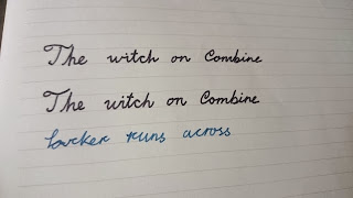
In my never-ending quest to find inexpensive papers which are fountain pen friendly, I came across the "Combine" brand from Daiso, which is has a impressive good quality for its price.
Another Daiso brand, "Complete", has a similar cover design but does not match up in quality, though the range of their paper products is wider compared to "Combine". Encouraged by a review by a fellow member in SFPL, I decided to try the "Complete" brand again, in hopes that their quality have improved.
The focus of the following test, is the comparison of the bleed through resistance between "Combine" and "Complete", B-line 40 sheets paper product. The main ink used is Sailor Bung Box's Ink of the Witch, and the pen is a Monteverde Invincia Titanium with a Fine nib
Combine Test:

Complete Test:


Conclusion:
Combine is still much more fountain paper friendly paper hands down. With hopes of redeeming the Complete brand, I also tried Parker Blue Black in a Parker 51 Fine nib, as well as a Platinum cartilage in a Plaisir 3.0 nib.
It seems that Complete will still work with dryer inks like Platinum and possibly Pelikan 4001, but I'll personally stick with Combine for now.
Another Daiso brand, "Complete", has a similar cover design but does not match up in quality, though the range of their paper products is wider compared to "Combine". Encouraged by a review by a fellow member in SFPL, I decided to try the "Complete" brand again, in hopes that their quality have improved.
The focus of the following test, is the comparison of the bleed through resistance between "Combine" and "Complete", B-line 40 sheets paper product. The main ink used is Sailor Bung Box's Ink of the Witch, and the pen is a Monteverde Invincia Titanium with a Fine nib
Combine Test:


Complete Test:


Conclusion:
Combine is still much more fountain paper friendly paper hands down. With hopes of redeeming the Complete brand, I also tried Parker Blue Black in a Parker 51 Fine nib, as well as a Platinum cartilage in a Plaisir 3.0 nib.
It seems that Complete will still work with dryer inks like Platinum and possibly Pelikan 4001, but I'll personally stick with Combine for now.
Monday, April 27, 2015
Unboxing: Platinum 3776 Century Chartres Blue 14k UEF Nib

Won it on an Ebay bid

Purchased on 23 April, delivered on 27 April

Packaging arrived in good condition


This set didn't come with a converter (already had one) but there are sets that do.

UEF nib, a little too scratchy for me but more on that later.
Monday, April 20, 2015
Review: Retro 51 Lincoln EXT Copper Tornado Fountain Pen

Quick scores
Appearance: 4.5/5
Nib: 4/5
Comfort: 3/5
Build: 2.5/5
Design: 3/5
Total: 17/25
Appearance
What drew me to the pen was the somewhat steam-punk look, the brushed copper finish, and threaded cap design is almost everything I hoped it would be. Almost. Uncapped, the plain, black plastic section does not carry the look through and disappointed me a little.Nib
Out of the box, the nib was smooth with a little feedback, which can be easily adjusted with a buffering stick. The stainless steel Schmidt is a little large for my taste but does match with the look of the pen, though the lack of a 14k/18k nib option loses some points with me.
Comfort
This is not the most comfortable pen to write with, the large nib forces my hand to a higher position and adds pressure to my waist and forearm. I can foresee my arm tiring quickly in long writing sessions.
Build
There are bits of contact glue left over between the end of the pen and the body, and the metal body screws directly onto the plastic section, raising concerns about the durability of the plastic threads.
Design
The pen is well balanced when not posted, with a heavy cap, posting will be uncomfortable.
A big part of the problem in this pen's design lays in the section, the overly smooth section lacks grip, and does not have any stoppage to prevent your fingers from gripping onto the nib and feed. A few sentences in and my finger was already inked up from accidentally touching the feed.
Conclusion
The Retro 51 Lincoln EXT Copper Tornado is a good looking pen with a few design flaws. Overall, the pen will still serve as a decent writing instrument, though I will hesitate to recommend it to others.
Tuesday, March 31, 2015
ESS registrar's ink unboxing
10 days after ordering from E.S.S. Stationery Supplies:


The cardboard box was squashed but no biggie
Bottle was in good order.
Loaded it into a Parker 45 with 14k nib. The choice of pen is so that, if the ink clogs the pen, I can easily take it apart after soaking. 14k nib to prevent rusting from the inks acidity.
And yes Jeffrey, your vital is already.
A quick test on poor quality paper shows minimum bleed through and no feathering, my original purpose for the ink was for use on poor quality papers, it seems to fulfill that nicely.
Sunday, February 1, 2015
Making an inexpensive pen storage case
One of the problems of being a fountain pen hoarder collector owner is how to storage them away when they are not in use. While there are cases and wraps available in stores and websites, they are either too expensive for me to justify them as storage or too soft to offer any protect.
My solution is to make my own, with plastic DVD racks from Ikea and B4 sized plastic cases from Daiso, a little assembly produces an inexpensive solution for my normal fountain pens.
The DVD racks in question look like this:


Using a box cutter, I cut out a piece of the DVD rack to fit inside the Daiso case, the end result looks like this:

This design is meant as a static storage solution, not as a means to carry pens around. One of the drawbacks I've heard from others using the DVD rack this way, is that the spacing between the dividers is to narrow for fat pens like the Jinhao 159.
Some variations to think about are sponge strips to prevent the pens from bumping into the top or bottom of the case, strips across the rack to prevent rattling, velvet lining to provide better protection, etc, make your own and post photos in the comments!
My solution is to make my own, with plastic DVD racks from Ikea and B4 sized plastic cases from Daiso, a little assembly produces an inexpensive solution for my normal fountain pens.
The DVD racks in question look like this:
Sadly they were out of stock the last time I visited Ikea, hopefully they will bring them back. The B4 Daiso plastic cases look like this:
Using a box cutter, I cut out a piece of the DVD rack to fit inside the Daiso case, the end result looks like this:
This design is meant as a static storage solution, not as a means to carry pens around. One of the drawbacks I've heard from others using the DVD rack this way, is that the spacing between the dividers is to narrow for fat pens like the Jinhao 159.
Some variations to think about are sponge strips to prevent the pens from bumping into the top or bottom of the case, strips across the rack to prevent rattling, velvet lining to provide better protection, etc, make your own and post photos in the comments!
How to take an Omas 361T apart
While discussing about the Omas 361 series, a fellow member at the Singapore Fountain Pen Lovers facebook group mentioned that he had problems opening up his 361T. I had the same problem so I googled a little, and found a post on The Fountain Pen Network which discussed how to do so briefly (Thanks roberto v!)

Here is how I did it (disclaimer: Follow at your own risk!)
First I had to remove the pin in the piston knob, I did this by pushing it out with a plastic toothpick, and pulling the rest out with a pair of rounded nosed pliers. After that, I unscrewed the knob all the way to remove it, it came out with any resistance.

After removing the knob, I unscrewed the piston rod a little to gain some length, then fished out the rest of the piston assembly.


Here is how I did it (disclaimer: Follow at your own risk!)
After removing the knob, I unscrewed the piston rod a little to gain some length, then fished out the rest of the piston assembly.
To remove the cork from the assembly, I unscrewed the hard plastic screw holding it in place.
And that was it, looks like I need to replace the cork T.T. Hope this helps!
Subscribe to:
Posts (Atom)